In the upcoming series, we'll dissect each of the five principles of design, accompanied by real-world examples.
Welcome to another edition of the Shoot First blog, where we delve into the intricate world of visual effects.
One of the amazing and terrifying things about VFX is that one way or another, you need to understand all the visual components of filmmaking, even if you never step foot on set, because you need to be able to reproduce them digitally.
Because of that, we’ll be starting a mini-series in understanding design, which is at the heart of creative storytelling, and therefore the heart of all things film and VFX!
In the upcoming series, we’ll dissect each of the five principles of design, accompanied by real-world examples.
It’s crucial to recognize that these principles are not rigid rules, nor are they meant to be broken. Instead, think of them as guiding concepts. Once you grasp these concepts, you gain the freedom to incorporate them into your work in a way that suits your vision and goals.
First Up: The Art of Balance
Our focus today is on the first principle: Balance. Luckily for us, balance in imagery follows the exact same physics as in real life.
The idea is the same if it’s a character, or a frame composition, but let’s look at them separately:
Shot Composition
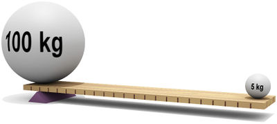
The kitchen scales
Envision your frame as a set of scales, with a central divide. If one side contains more dense imagery than the other, the frame becomes unbalanced, leaning in that direction. This applies not only to a vertical split but also to a horizontal one, maintaining equilibrium across the top-bottom axis.
Balancing the shot is as simple as balancing scales - although visual “mass” isn’t just size, it can also be color (more saturated colors carry more weight).
The invisible scales
There’s one more axis that we need to consider, and that runs from the camera to the vanishing point in the background. Balance here gives us depth.
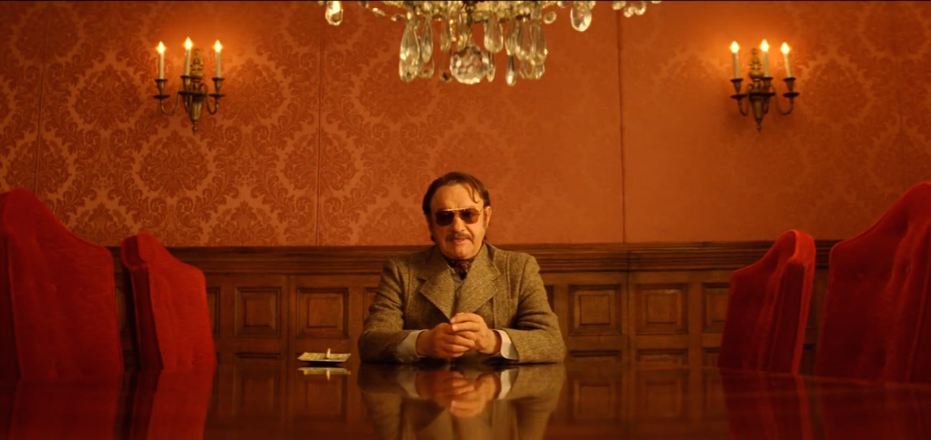
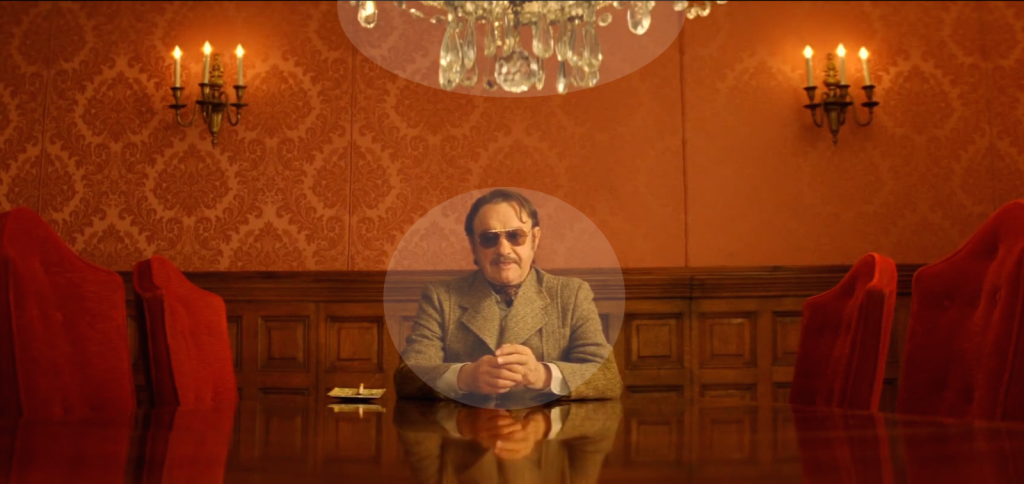
The fulcrum
You can balance a shot by making it symmetrical, Wes Anderson style. But you can also balance it by having less weight further from the fulcrum, just like real life. This is very powerful when you’re balancing the depth.